5 Tips For Using Your Church App To Nurture And Engage Your Community
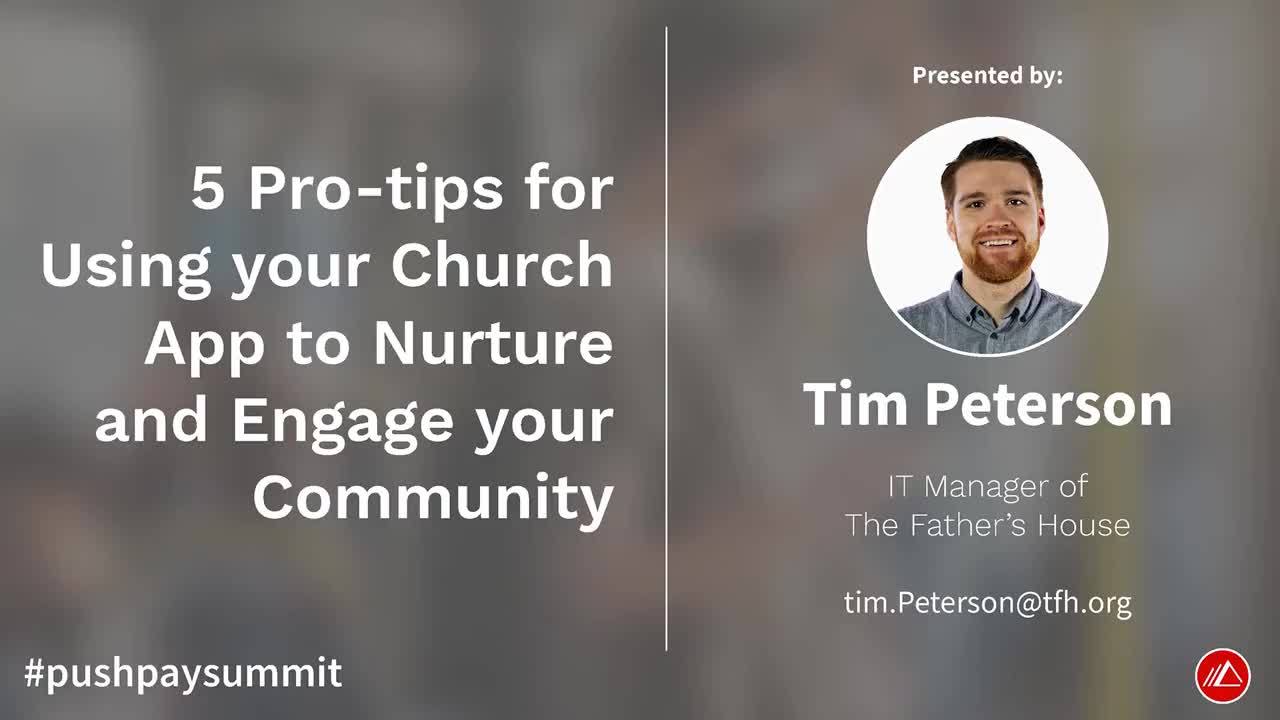
The Father's House uses a custom church app to deepen engagement with their congregation. Tim Peterson shares 5 tips for building a church app.
Tim Peterson has quite a few ideas about the role of technology in the church. And we were so pleased to hear from him at the 2019 Pushpay Summit church leadership conference in Dallas, Texas.
As the IT Manager of The Father’s House, a multi-site ministry located in Northern California, Tim works alongside other church leadership on a daily basis to use their church’s app as a tool to nurture people toward deeper engagement with the church.
Here are his five recommendations for using a church app to nurture engagement and belonging with your community.
1.Know Your Audience
When The Father’s House first launched their app, they didn’t immediately determine a primary audience for it. But shortly after the app was live, it became apparent that a clearly defined audience was necessary to tailor content in a way that would drive community member engagement. If your church staff doesn’t know who the app is for, it’s extremely difficult to create content that appeals to that unknown audience.
Work with the rest of your team to determine who your church app is for. Yes, you’re targeting people who are coming to your site, but be more granular. If you try to be everything to everyone, you’re probably not going to be relevant to anyone at all.
The Father’s House targets people who have been attending the church for a while, call the church their home, and are looking to engage even further with the church.
By defining that target audience, it also clarifies who they’re not targeting—and that’s first-time attendees or newcomers. Asking first-timers to download the app is a big ask so while The Father’s House has an in-app connect card, they focus more on driving newcomers to paper cards or other in-person connection points. They also don’t utilize the app to advertise to people who had never been there.
When you know your audience, you can better figure out what content you want to have and how you use the various features.
(Tim Peterson, IT Manager at The Father’s House, discussing their custom church app at Pushpay Summit 2019.)
2. A Personalized Experience
Apps are masters at personalization.
Top apps like Amazon and Netflix deliver custom content feeds to users to encourage more engagement in the app. And it’s not just shopping, news, and content apps like YouTube doing this. Tim and his team work diligently to create personalized experiences within their app.
Within their Pushpay app, they begin this customization journey by allowing app users to immediately identify the campus they attend when they open the app. This helps churches eliminate noise—irrelevant content—so app users can focus on relevant content.
So instead of having to dig through a poorly-designed app to find information on their specific campus, app users can receive only the information, event details, and content that pertains to their location. The Father’s House also has access to other features that help with personalization, like related content cards that show people similar content within the app, giving them more opportunities to engage with the church and consume sermons, videos, music, etc.
App users can also create profiles that make it easier for administrators to curate content and make it available to people based on defining characteristics. For many churches, this means sending rich push notifications about an upcoming women’s retreat to all of the people who indicated they’re interested in women’s ministry topics in their profile.
There are a number of other in-app features that churches can use to customize their content. To learn how your church can use a custom app with Pushpay to better engage with your community, talk to an expert today!
3. Native Content is King
90% of all mobile, web traffic is done through apps. Apps are the way people are already consuming content, how can your church build an app in a way that helps people stay engaged? At first, The Father’s House used their app to host links to external sites, like places to register for events or view the latest sermon. But that reduced app stickiness, engagement, and under-utilized this resource.
A page full of links is an obstacle for people who aren’t tech-savvy. When faced with external links, it’s easier to simply close and delete the app than to decipher which link to use to do the single thing they were trying to accomplish.
People are looking for a content-rich experience and that requires embedding apps with content, as opposed to linking out to websites. Having everything built-in streamlines the user experience so people can do exactly what they were trying to do right from the app. That means actions, like donating to a campaign or registering for an event, can be done quickly and intuitively.
For instance, The Father’s House held an event and added a page in the app dedicated to it. Instead of adding a link to an external registration page, they hosted the event information right in the app and allowed people to register on the spot.
4. Keep It Fresh
Update content on a regular basis. When people open up the app, there should be something new and different periodically to keep people interested and engaging with your newest content. If you’re like most churches, you have new sermons, events, and a multitude of happenings on a regular basis. Have a plan for how you’ll create content from those activities and update your app to ensure your community has access to the lastest at your ministry.
For The Father’s House, they update their app based on when they have events or something going on and they make this information available via their app’s dynamic home screen. So whenever someone opens their app, the first thing they are greeted with is the latest information they should know.
5. Communicate The Plan
Get tech and leadership teams on the same page about what the plan for the app actually is. As with determining an audience for your platform, it’s critical to also have a strategy for updating the app, what kind of content makes it onto the app versus the website, and how you communicate about the app with your congregation.
Tim and his team sat down with the church executives to determine what type of content their app users need in order to stay engaged. This will look different for each church and vary based on the demographic make up of your ministry, your church’s roadmap, and app audience.
Once The Father’s House figured out their plan for the app, they communicated it to the rest of the leadership team. The next step is to communicate about the app to the church.
At first, this means having church leaders talk about the app from the stage. Over time, it trickles down as regular attendees start referring others to the platform. Soon enough, people realize that if they want to get engaged, the app is the best place to go.
When it comes to sharing information about your app with your congregants, keep the following in mind: People need to know there is an app, they need to understand why it’s relevant to them, and how they download the app. Much of this information can be displayed via a slide during your services.
Your Custom Church App
The Father’s House is just one of over 7,900 churches that use a custom church app with Pushpay to engage their congregants on a deeper level. And they’re just one of the reasons our team of engineers and product marketers continue to develop more product features and tools to make giving and engagement an intuitive, easier process for your community.
To see how our custom app features help churches like yours better nurture congregants, talk to one of our church technology experts today!


