Search
  1-844-PUSHPAY
 How This Church Increased Online Giving 46% with One Simple Change
The average monthly giving by faithful churchgoers has declined. See how Mars Hill reversed that trend with one simple change in online giving.

How do you increase giving when church attendance is declining?
In recent years, the average monthly attendance by faithful churchgoers has declined. A 2016 Pew Research survey says the biggest issue is the logistics of actually getting to church. Our increasingly busy schedules, especially for those with families, make it difficult to attend services on a weekly basis. Even the most dedicated churchgoers attend, on average, about two weekends per month.
One of the biggest challenges with sporadic church attendance is unpredictable giving. People often wait to give only when they are in a church service, and most churches don’t have an easy way to give online.
If a decline in attendance corresponds with a decline in giving, how can church leaders create more consistency in giving?
How One Church Easily Increased Online Giving
The first step is getting an online giving tool like Pushpay. Getting a new tool is a quantum leap forward for many churches.
But another step is just as powerful: Make the giving button obvious on your website. People committed to your church remember to give when they aren’t on campus, yet they may struggle to find where to give on your website.
This was an obstacle faced by Josh Taylor, Administrative and Teaching Pastor at the People of Mars Hill in Mobile, AL. Taylor knew their previous website was good, but it didn’t seem to resonate well with people. So he used the StoryBrand framework to rethink his website strategy and create a new plan.
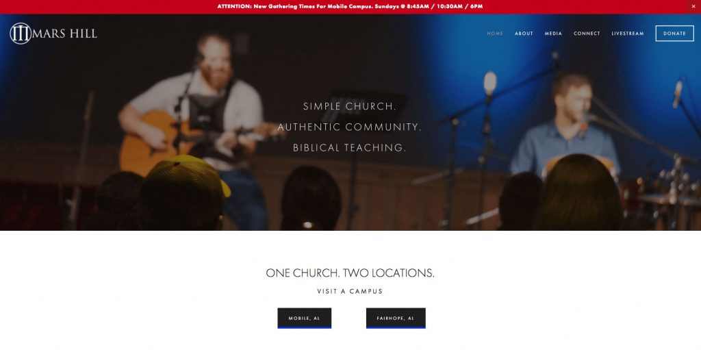
Just 60 days after launching the new site, the church noticed a 46 percent increase in online giving.
Why the big jump? Taylor slapped a big DONATE button in the top right corner of the website.
Here’s why that works: The human eye often reads a website in a “Z” pattern. The eyes start in the top left corner, the place where most companies button their logo. Then the eyes go to the top right corner where the DONATE button is now located. As the eyes move downward and to the left, they notice the next in the heading of the site. Lastly, scanning from left to right, the eyes notice any additional text or buttons.
The original website wasn’t poorly designed. In fact, the design changes to the website weren’t significant. Overall style and feel are pretty consistent. But the thing that makes the new site perform so well? It was designed with the user in mind.
When creating a church website, remember to think about the perspective of the user:
- What are they looking for?
- How can we communicate things in a way they understand?
- What’s the next step a website visitor should take?
Why This Change Works
For a church that wants to increase online giving, a great next step is adding a GIVE or DONATE button to the top right corner of the website. This simple move accomplishes two things:
- People know where to give when they go on the website. Those who remember to give away from the weekend service can quickly find the online giving portal. If it’s impossible to find, people won’t take action.
- It’s easier to communicate where people can give online. Announcing how to give online can be much simpler with this little change. Someone can say “Go to our website and click the GIVE button in the top right corner.” Making it that easy will encourage people to take the next step.
Not only have they seen an increase in online giving, they also saw:
- 175% increase in unique visitors.
- 25% increase in weekly attendance.
- 2.5x increase in livestream views.
The only thing different at the church? A website that clearly showed people what they need to do next.
Companies who do make money online use this strategy to generate leads and create sales for their business. Why? Because it works. When the next step is clear, people will take it. It works in business, and it works in the church too.
Talk to a Pushpay expert today to discover how your church can use world-class giving technology to revolutionize generosity within your community.